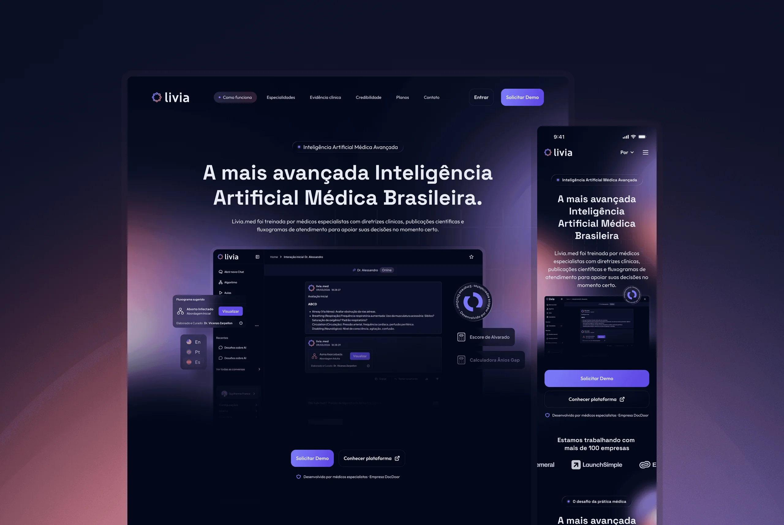
livia.website
A landing page for a medical AI product, designed to earn a doctor's trust in the first scroll and turn interest into action.
- role
- UX/UI designer
- year
- 2026
- timeframe
- 2 months
- tools
- Figma · Photoshop · Illustrator
- category
- UX/UI design
- design
- Sam Marxz
overview
livia helps doctors make evidence based decisions, which is a hard promise to communicate. The page needed to sound credible to a skeptical and busy audience, explain a complex product quickly, and still feel warm enough to invite a next step.
approach
The structure orders information by hierarchy to keep cognitive load low. Immersive visuals set the tone, but they sit on a solid base of legibility and usability, so aesthetics never compete with comprehension.
Three product concerns guided every section of the layout: where each call to action points, how scannable the content is for someone skimming between appointments, and how credibility accumulates along the scroll.
key decisions
A few choices carried most of the result and kept the page honest about its job.
The hero states the value in one sentence before any feature talk begins.
Proof and credibility cues are distributed along the page instead of concentrated in a single block.
One primary action repeats with consistent language, so the next step is never ambiguous.
outcome
The result is a page that does more than present the product. It walks the visitor through value, proof and action as one continuous argument, from the first headline to the final call.