my expenses
A full redesign of a personal finance app on Google Play, driven by what a thousand user reviews had been quietly asking for.
- role
- Product designer
- year
- 2022
- timeframe
- 2 months
- tools
- Figma
- category
- Product design · design system
- design
- Sam Marxz, for QuickTools
- Downloads
- 100k+Downloads
- Ratings
- 11k+Ratings
- Average score
- 4.8Average score
overview
Keeping track of monthly expenses is one of those tasks people know they should do and quietly avoid. The app exists to make that habit feel light, especially for someone who has never been comfortable with personal finance.
I had designed its first version in 2020. Two years later I came back to rebuild it, this time with something the original never had: thousands of real users telling us exactly where it hurt.
scope
The project covered the product end to end, from the audit that started it to the assets the developers would build from.
Redesign of the full app experience
Interface design across every screen
Component library
Interactive prototype
Style guide
research
By then the app had passed a thousand ratings on the store, which is a research panel most projects never get for free. I read through more than a hundred of them, positive and negative, and grouped the recurring complaints into themes.
The pattern was clear. People were not asking for new features so much as asking the app to stop making them work. Every top complaint was friction that the interface itself had created.
solution
Four problems came up often enough to shape the redesign, and each one earned a direct answer in the new version.
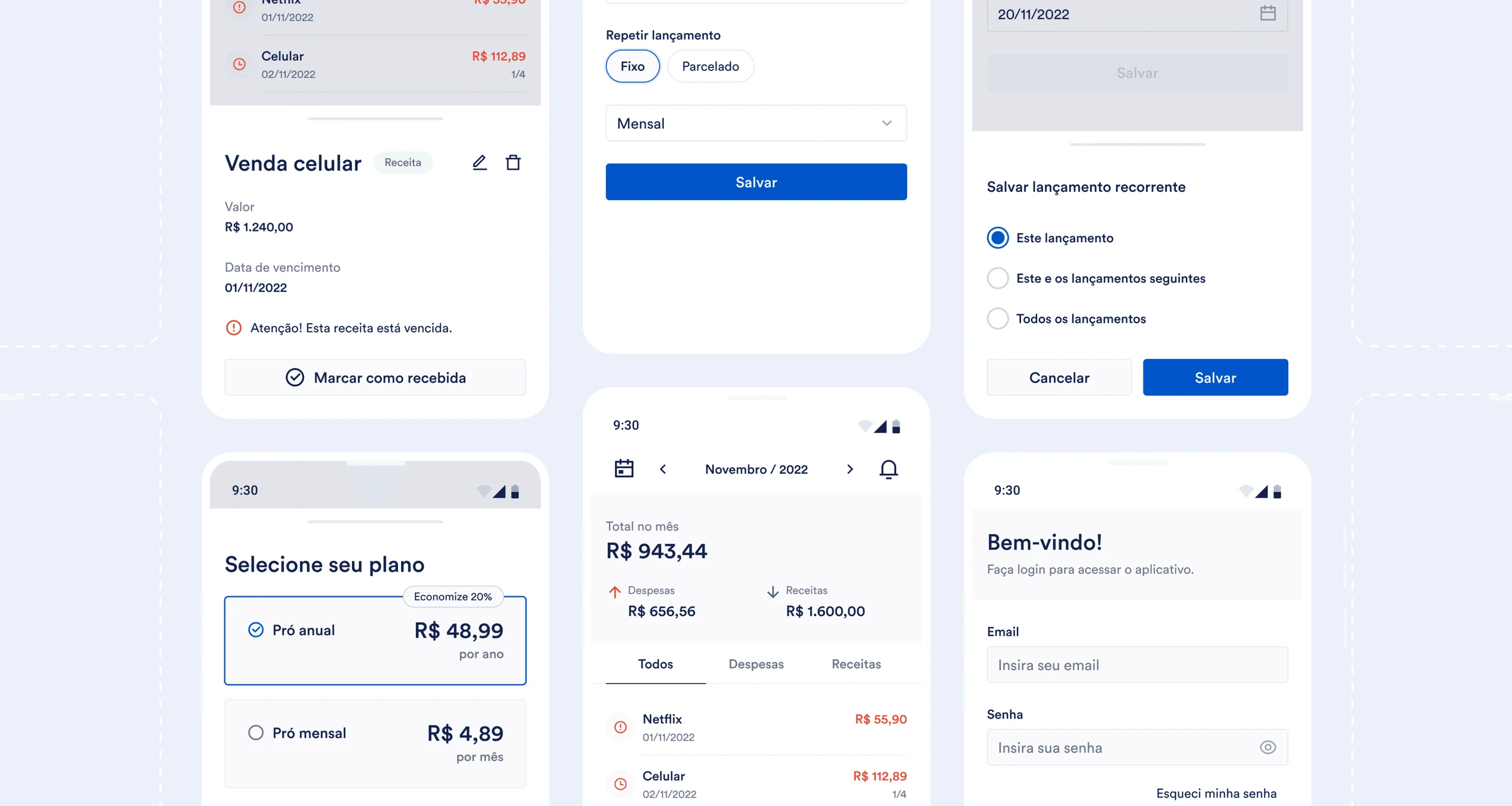
Bills were slipping past their due date unnoticed, so the app now warns the user as a due date approaches.
Removing ads was confusing, so a subscription with clear monthly plans replaced the guesswork.
Recurring entries had to be edited one by one, so editing one now updates the whole series.
The home screen broke down with large amounts, so it was rebuilt to stay clean and readable at any value.
interface
The new interface keeps everything the old one could do and adds what people had been asking for, while feeling simpler to move through. Density gave way to hierarchy, and the daily actions moved to where the thumb already lives.
design system
Two years without maintenance had left the interface full of small inconsistencies, the kind that accumulate quietly until nothing quite matches. Rather than patch them screen by screen, I documented the foundations first, from typography to the color palette.
A component library followed, so the same decisions could be reused instead of redrawn. It saved time during design, and it gave the developers one source of truth to build against.
outcome
The app went on to pass a hundred thousand downloads and eleven thousand ratings, holding a 4.8 average on Google Play. The redesign turned a popular but frustrating tool into one people were willing to recommend.
learnings
Store reviews turned out to be the most useful research material of the whole project. They cost nothing to gather and they point straight at the friction people actually feel, which is rarely the friction a team assumes.
The harder lesson came after handoff. The released build drifted from the design in places, mostly because communication with the developers thinned out near the end. Documentation alone does not carry a design across the finish line, and staying close to the build is part of the designer's job.